Design · UI/UX
Design Systems in 2026 — Component Libraries, Tokens, and What Actually Works
Design systems have matured from experimental to essential. Here's how to build, maintain, and scale a design system that actually gets used.

Anurag Verma
7 min read
Design systems have evolved from aspirational to essential. Companies without them ship inconsistent products, waste engineering time rebuilding components, and struggle to maintain quality at scale.
But most design system efforts fail — not from lack of effort, but from misunderstanding what design systems actually are and how to make them successful.
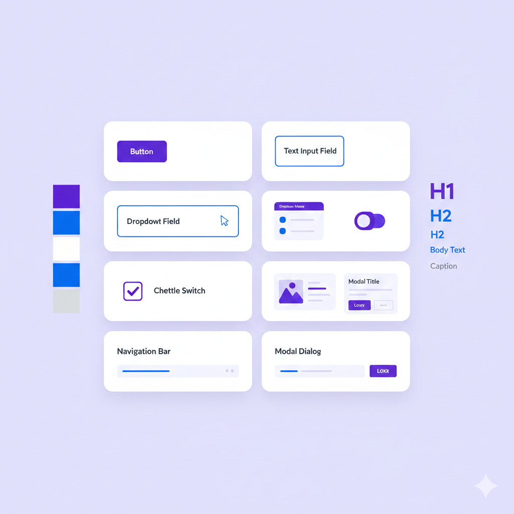
A design system is a product that serves other products
What Is a Design System
A design system is more than a component library:
Design System Layers
├── Foundations
│   ├── Design tokens (colors, spacing, typography)
│   ├── Grid and layout principles
│   └── Animation and motion
│
├── Components
│   ├── Primitives (Button, Input, Card)
│   ├── Composites (Form, Modal, DataTable)
│   └── Patterns (Search, Navigation, Auth)
│
├── Documentation
│   ├── Usage guidelines
│   ├── Accessibility requirements
│   ├── Code examples
│   └── Best practices
│
└── Governance
    ├── Contribution process
    ├── Versioning and updates
    └── Support model
A component library is one layer. A design system is the whole stack.
The 2026 Landscape
Mature Open Source Options
| System | Framework | Strengths | Best For |
|---|---|---|---|
| shadcn/ui | React | Copy-paste, customizable | Custom designs |
| Radix | React | Headless, accessible | Building on primitives |
| Chakra UI | React | Complete, themeable | Rapid development |
| Material UI | React | Comprehensive, Google design | Enterprise, material design |
| Mantine | React | Full-featured, good DX | All-in-one needs |
| Headless UI | React/Vue | Tailwind integration | Tailwind users |
| Ark UI | Multiple | Multi-framework | Consistent cross-framework |
Key Trends
1. Headless Components Separate behavior from styling. Radix and Headless UI pioneered this.
2. Copy-Paste Over Install shadcn/ui popularized copying component code into your project rather than npm installing.
3. Design Tokens Everywhere Figma Variables, Style Dictionary, and native CSS custom properties have made tokens practical.
4. AI-Assisted Design Tools like v0.dev generate component code from descriptions.
Building Your Design System
Start With Tokens
Design tokens are the foundation:
/* CSS Custom Properties (Design Tokens) */
:root {
  /* Colors */
  --color-primary-50: #eff6ff;
  --color-primary-500: #3b82f6;
  --color-primary-900: #1e3a8a;

  /* Spacing */
  --space-1: 0.25rem;
  --space-2: 0.5rem;
  --space-4: 1rem;
  --space-8: 2rem;

  /* Typography */
  --font-sans: 'Inter', system-ui, sans-serif;
  --font-size-sm: 0.875rem;
  --font-size-base: 1rem;
  --font-size-lg: 1.125rem;

  /* Radii */
  --radius-sm: 0.25rem;
  --radius-md: 0.375rem;
  --radius-lg: 0.5rem;

  /* Shadows */
  --shadow-sm: 0 1px 2px rgba(0, 0, 0, 0.05);
  --shadow-md: 0 4px 6px rgba(0, 0, 0, 0.1);
}
Tokens enable:
- Theme switching (dark mode, white-labeling)
- Consistent spacing and sizing
- Easy global updates
- Design-dev synchronization
Component API Design
Good component APIs are:
Composable:
// Bad: monolithic prop
<Card
  title="Header"
  description="Content"
  footer="Footer"
/>

// Good: composable children
<Card>
  <Card.Header>Header</Card.Header>
  <Card.Body>Content</Card.Body>
  <Card.Footer>Footer</Card.Footer>
</Card>
Accessible by Default:
// Component handles accessibility internally
<Dialog open={isOpen} onClose={close}>
  <Dialog.Title>Confirm Action</Dialog.Title>
  <Dialog.Description>
    This action cannot be undone.
  </Dialog.Description>
  <Dialog.Actions>
    <Button onClick={close}>Cancel</Button>
    <Button variant="danger" onClick={confirm}>Delete</Button>
  </Dialog.Actions>
</Dialog>
// Focus trap, escape key, aria attributes handled automatically
Consistent Variants:
// Consistent variant naming across components
<Button variant="primary" size="md" />
<Badge variant="primary" size="md" />
<Alert variant="primary" />

// Variants: primary, secondary, danger, warning, success
// Sizes: sm, md, lg (where applicable)
Documentation That Gets Used
Documentation should include:
1. Interactive Examples Live code playgrounds, not just code blocks.
2. Copy-Paste Ready One click to copy working code.
3. Props Reference Clear prop types with descriptions and defaults.
4. When to Use Guidance on appropriate contexts.
5. Accessibility Notes ARIA requirements, keyboard navigation, screen reader behavior.
6. Do/Don’t Examples Visual examples of correct and incorrect usage.
The Adoption Problem
The hardest part is adoption. Design systems fail when teams do not use them.
Why teams do not adopt:
- Components do not fit their needs
- Documentation is lacking
- Quality is unreliable
- Updates break things
- Getting help is hard
Drive adoption by:
- Build what’s needed. Talk to teams about their pain points.
- Make it easy. Great documentation, copy-paste code, responsive support.
- Ship quality. Rigorous testing, accessibility compliance, visual regression tests.
- Communicate changes. Clear changelogs, migration guides, deprecation warnings.
- Provide support. Dedicated Slack channel, office hours, contribution support.
Build vs Buy
Use Existing Systems When
- You need to move fast
- Design is not a differentiator
- Team lacks design system expertise
- You are building internal tools
Recommendation: Start with shadcn/ui or Radix + Tailwind. Customize to your brand.
Build Custom When
- Brand differentiation is critical
- Unique interaction patterns
- Multiple products need consistency
- You have dedicated resources
Approach: Start with headless components (Radix, Ark UI), add your design layer on top.
The Hybrid Approach
Most successful design systems are hybrid:
Hybrid Design System
├── Primitives: Radix UI (headless)
│   └── Handles behavior, accessibility
│
├── Styling: Tailwind + custom tokens
│   └── Handles visual design
│
├── Custom components: Built on primitives
│   └── Application-specific patterns
│
└── Documentation: Storybook
    └── Handles docs, testing, showcase
You get accessibility and behavior for free, focus effort on visual design and documentation.
Tools and Infrastructure
Design-Dev Handoff
Figma → Code:
- Figma Variables for design tokens
- Export to Style Dictionary or Tokens Studio
- Generate CSS/JS token files automatically
Figma Variables → Tokens Studio → Style Dictionary → CSS VariablesDevelopment Environment
Storybook remains the standard:
- Component documentation
- Visual testing
- Interaction testing
- Accessibility testing
# Setup Storybook
npx storybook@latest init
Testing Strategy
| Test Type | Tool | Purpose |
|---|---|---|
| Unit tests | Vitest/Jest | Component logic |
| Accessibility | axe-core, pa11y | WCAG compliance |
| Visual regression | Chromatic, Percy | Catch visual changes |
| Interaction | Storybook play functions | User flows |
Versioning and Publishing
Semantic Versioning:
- Major: Breaking changes
- Minor: New features, backward compatible
- Patch: Bug fixes
Changelog: Automated with Changesets or conventional commits.
Publishing:
- npm for packages
- Storybook for documentation
- Figma for design files
Common Mistakes
1. Building Too Much Too Soon
Start with 5-10 components that cover 80% of needs. Expand based on actual demand.
2. Designing in Isolation
Design systems built without input from consumers fail. Involve product teams early and often.
3. Neglecting Maintenance
A design system is a product. It needs ongoing investment:
- Bug fixes
- New features
- Documentation updates
- Version upgrades
- Support
4. Over-Abstracting
Not everything needs to be a generic component. Some patterns are specific to one product — and that is okay.
5. Ignoring Accessibility
Accessibility cannot be added later. Build it in from the start, test it continuously.
Making It Work
A successful design system requires:
- Dedicated ownership. Someone responsible for quality and roadmap.
- Investment. Real engineering and design time, not side-project hours.
- Clear scope. What is in vs out, what level of customization is supported.
- Feedback loops. Regular communication with consumers.
- Continuous improvement. Regular releases, responsive support.
The goal is not a perfect component library — it is a system that helps teams ship consistent, accessible products faster. Focus on that outcome, and the system will follow.
More from this category
More from Design


The dispatch
Working notes from
the studio.
A short letter twice a month — what we shipped, what broke, and the AI tools earning their keep.
Discussion
Join the conversation.
Comments are powered by GitHub Discussions. Sign in with your GitHub account to leave a comment.